- Inclusive signage combines visual, tactile, audio, and technological resources to provide independent guidance.
- UNE 170002, RD 1/2013, RD 505/2007 and Directive 2019/882 set the legal and technical framework.
- Key typologies: directories, directional signs, and confirmation signs; plus pavements, Braille, and audio.
- Validation with common users and criteria (pictograms) guarantee understanding and consistency.
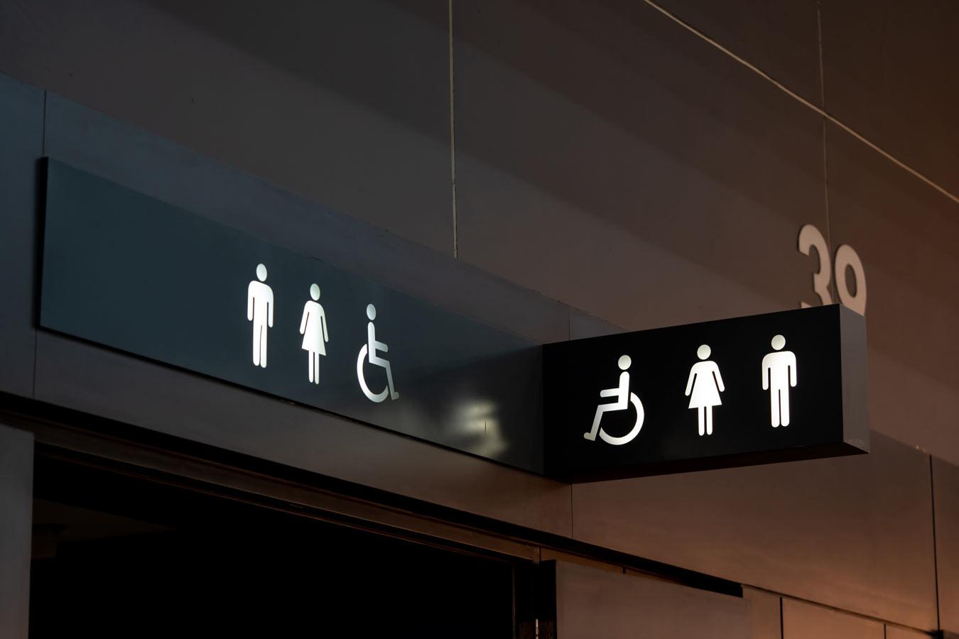
In recent years, the conversation about accessibility has shifted from being optional to becoming a cross-cutting priority. In public buildings, hospitals, schools , shops, urban spaces, and sports centers, signage can no longer simply "indicate"; it must guarantee that everyone, regardless of their sensory, cognitive, or motor abilities , can orient themselves and move around independently and safely.
Ultimately, we're talking about accessible and inclusive signage. It's an approach that combines design, regulations, and technology to eliminate information and wayfinding barriers. And, although it may sound complex, a significant portion of these solutions are viable and scalable: from the correct use of color contrasts and legible typography to the incorporation of Braille, raised relief, validated pictograms, or audio systems and hearing loops.
What is accessible signage and why it matters
Accessible signage encompasses all spatial communication resources designed to be clear, understandable, and usable by the entire population . Its goal is for information to be immediately perceived and become a useful guide for decision-making in environments that are often complex or crowded.
This approach relies on visual, tactile, auditory, and digital strategies that work together. It's not enough for signs to simply "be seen": they must be readable, audible, or tactile, depending on the user's needs. Thus, a sign is truly inclusive when it doesn't require excessive effort in terms of location, attention, or comprehension.
Key components of an inclusive system
- Visual resources: high chromatic contrast, unambiguous iconography, legible fonts (preferably sans serif) and sizes sufficient for distance reading.
- Tactile resources: standardized Braille, raised texts, and tactile strips or surfaces to guide routes and warn of changes.
- Audible signaling: audible messages or beacons that help identify access points, elevators, or changes in direction, especially useful for people with visual impairments.
- Accessible technology: QR codes that expand information, magnetic induction loops on counters, and apps that offer personalized instructions or step-by-step guidance.
Practical examples that work
- Braille and high relief plaques to identify offices, bathrooms, rooms or elevators without relying on vision.
- Contrast and legible fonts following parameters such as those of UNE 170002, which facilitate reading for people with low vision.
- sound indication on subway, train, or elevator platforms, with floor and direction announcements, providing reliable guidance.
- Universal pictograms standardized and recognizable, used in public buildings (for example, in various facilities in Madrid) to facilitate understanding for people with cognitive difficulties or language barriers.
Regulations and standards you should know
Accessibility in signage is not a "nice to have": it is a legal and ethical requirement. In Spain and the EU, there are regulatory and technical standards that guide the way, such as UNE 170002 , Royal Legislative Decree 1/2013 , and Royal Decree 505/2007 , among others.
The UNE 170002 Standard includes universal accessibility requirements for signage: from design and materials to installation and maintenance, with the aim that any person, including those with visual or cognitive disabilities, can understand and use signage systems.
Royal Legislative Decree 1/2013 establishes the framework for equal opportunities and non-discrimination for people with disabilities, and Royal Decree 505/2007 specifies basic conditions of accessibility and non-discrimination in urbanized public spaces and buildings, for independent and safe use.
European Directive 2019/882 ( the European Accessibility Act) sets requirements for accessible products and services that promote inclusion at the EU level. Complementarily, recommendations from ONCE (the Spanish National Organization of the Blind) and other specialized organizations provide useful criteria on tactile, visual, and auditory signage.
In terms of certification, it is worth noting that AIS 1/2023 includes a modality for Unique or Protected Buildings, which opens avenues to act on historic properties through solutions compatible with their heritage value.
Real impact: autonomy, compliance and image
The implementation of inclusive signage promotes personal autonomy : people can move around, locate services, and make decisions without external assistance. This benefits users with disabilities, but also seniors, families with children, visitors who don't speak the language, or those with time constraints.
At the corporate and administrative level, accessibility avoids legal risks , facilitates certifications, and, in many cases, opens doors to funding or improvement programs. Furthermore, it has a direct effect on the overall experience: the clearer the system, the smoother and more satisfying the process.
Finally, prioritizing inclusive environments strengthens the social responsibility and reputation of both public and private organizations. Well-integrated accessibility is often perceived as a useful and human-centered attribute of innovation.
Information architecture: types of signals that cannot be missed
A robust system combines multiple levels of signage to guide users from the entrance to their destination. In complex contexts (such as hospitals), this is critical. The Clear Code® method , developed by PMMT Forward Thinking Healthcare Architecture after years of research, systematizes these needs based on the relationship between functional diversity and architectural space.
Promoted by Blanca Fernández (architect and Clear Code Manager) in 2018, among others, the Clear Code® approach demonstrates that a substantial part of universal accessibility depends on signage systems. It considers the behaviors and habits of users grouped into 13 functional profiles and highlights a key fact: nearly 40% of the population experiences some permanent or temporary limitation during their lifetime.
In this context, three main categories are distinguished: landmarks or directories (in plant entrances, receptions and landings), organizational signage and directional arrows (to remember the route and support decision-making) and destination confirmation signs (to verify that we have arrived at the correct place).
To avoid accessibility gaps between areas, it's advisable to add secondary systems: tactile paving, tactile paving, and directional guides , as well as using different textures and colors to distinguish zones and highlight points of interest. Signposting and highlighting obstacles along the route is another essential practice.
In vertical transportation systems, elevators must integrate tactile and auditory signaling , and evacuation routes must be clearly marked with minimal lighting and visual continuity. Furthermore, to enhance the overall sensory experience, buildings benefit from audiovisual systems and improved sound reception.
Inclusive signage in sports spaces: the case of a weight training area
Applying inclusive criteria to a gym or training area requires considering flow, safety, and clarity. First, directional signs must clearly mark entrances, exits, and routes, avoiding interference between those moving around and those exercising.
Secondly, it's advisable to include interpretive signs near drinking fountains, rest areas, and stretching zones, as well as on each piece of equipment, providing clear and easily accessible information. Thirdly, identifying signs help to define sections (warm-up, cardio, strength, stretching) and guide users within the facility.
Finally, the regulatory signs outline the rules for using and ensuring the safety of each piece of equipment, and reinforce hygiene and social distancing guidelines. By prioritizing safety and wayfinding, this system improves the experience for all users, regardless of language or familiarity with the room.
In terms of typography, the sports context demands crisp, high-performing letters from a distance: sans-serif fonts like Helvetica, Roboto, or Montserrat offer clean lines and high legibility. Appropriate sizes, good line spacing, and sufficient contrast should be used.
Color plays a strategic role. We can use blue for general instructions , green for stretching or calming areas , red for high-intensity areas or to highlight hazards , and yellow for warnings and precautions . This coding facilitates instant understanding of the environment.
The iconography, ideally minimalist and universal, works well with pictograms of human silhouettes representing exercises or actions, which are helpful for beginners or people with reading difficulties. The key is to maintain visual consistency and ensure comprehensibility.
Regarding materials, signage structures are typically made of stainless steel or aluminum due to their durability, while flooring uses non-slip paint. For furniture, treated wood or recycled plastic may be options depending on the climate and intended use.
Technology multiplies the reach: QR codes with video tutorials , low-energy LED lighting (even solar) to maintain nighttime visibility and, if appropriate, alarm systems or cameras geared towards the security of the environment.
A typical material proposal would include durable metal plates, laser-engraved for long-term legibility , and high-adhesion, non-slip horizontal markings. When properly implemented, all of this provides durability, safety, and efficiency in daily operations.
Pictograms and cognitive accessibility: towards common criteria
In addition to physical and sensory accessibility, cognitive accessibility is crucial for information to be easy to understand. A good example is the Guide to Good Practices for Accessible Signage in Buildings, presented in Seville, which brings together 150 accessible pictograms to standardize criteria in Andalusian spaces and facilitate consistent signage in similar facilities.
This guide, presented at the CaixaForum Auditorium with the participation of cognitive accessibility specialists and user representatives, aims to break down comprehension barriers, propose cognitive enhancement techniques , and serve as a foundation for public and private buildings. It is designed as a universally accessible and dynamic document: if new pictograms are needed, they can be designed using the same creation and validation criteria.
In organizations with multiple locations or different layouts, inconsistent signage and spatial organization negatively impact the daily lives of users. Establishing common and consistent criteria makes environments more welcoming and predictable for professionals, families, and people with disabilities, improving wayfinding and reducing cognitive load.
Myths and realities about accessibility that should be dispelled
There are widespread misconceptions that hinder the implementation of inclusive measures. The first is cost. Reality : many improvements are low-cost (good signage, furniture adjustments, non-slip materials) and, moreover, their return on investment is high by expanding the user base, increasing satisfaction, and reducing risks.
"Only people with disabilities need accessibility." Reality : It benefits everyone. Families with strollers, tourists, seniors, and those with temporary injuries all benefit from clear routes, pictograms, audio, and tactile signage.
“Adapting an old building is impossible.” Reality : it requires sensitivity and tailored solutions, but it is feasible. The AIS 1/2023 certification includes a specific option for unique or protected buildings, balancing accessibility and heritage preservation.
"Accessibility equals building ramps." Reality : accessibility is comprehensive and includes adapted bathrooms, adequate passage widths, lighting, acoustics, Braille and haptic signage, and cognitive measures such as easy-to-read materials or pictograms.
"People with visual impairments don't need signage." Reality : they need it, and a lot of it. Braille, raised relief, audible alerts, and tactile paving are key to navigating independently in complex buildings.
"Complying with regulations is enough." Reality : regulations are the minimum. Going further and evaluating the real-world experience with diverse users is what ensures that the space is truly usable.
"People with disabilities prefer not to go out." Reality : what limits their presence in public spaces is not preference, but barriers. When an environment is accessible and intuitive, participation clearly increases.
"Accessibility ruins aesthetics." Reality : good design integrates accessibility without sacrificing visual appeal. In fact, it's often invisible when well implemented, and only noticeable when it's missing.
"It's something only for public spaces." Reality : it's also essential in offices, educational, healthcare, and judicial centers, and in shops. Inclusion permeates working life, learning, health, and leisure.
"Once it's built, there's nothing to be done." Reality : there is ample room for improvement with subsequent interventions: clear signage, lighting adjustments, tactile and audio signage , accessible routes, and appropriate street furniture.
Practical keys to implementing a system that works
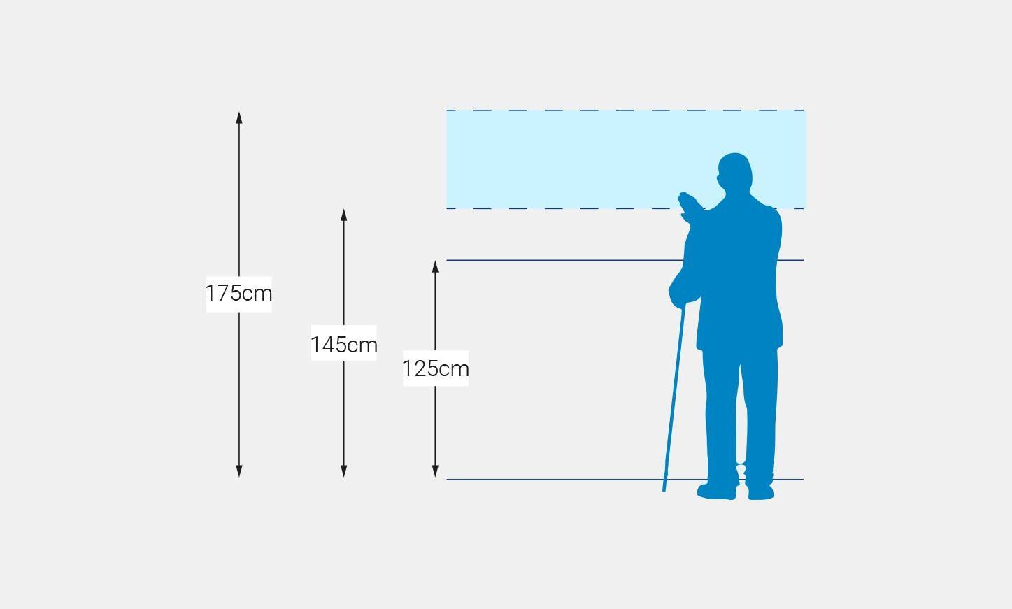
Start with strategically placing signs: at decision points (entrances, intersections, elevator cores, floor changes), at standard heights and with guaranteed visibility. Eliminate visual obstructions and respect safety distances.
Select certified materials that are resistant to fire, corrosion, and vandalism. Prioritize robust supports and anti-glare finishes. For tactile signage, pay attention to the relief, installation height, and legibility of the braille.
Validate with real users. Involve people with visual, hearing, motor, and cognitive disabilities in prototype usability testing and final review. Adjust sizes, contrasts, messages, and placements based on that evidence.
Integrate technology thoughtfully. QR codes should link to accessible content (easy-to-read, audio, or subtitled video), and induction loops at counters must be clearly marked. If you use apps, make sure they offer step-by-step navigation and are compatible with screen readers.
Specialized services and community work
For many projects, having teams with specific training in accessibility provides guarantees. Inclusive design firms and architecture studios with experience in accessible signage plans can coordinate audits, design, manufacturing, and installation.
Collaboration with social organizations and validation groups composed of people with diverse abilities (as is the case in projects carried out in conjunction with specialized foundations) ensures that communication is appropriate, understandable, and verifiable . Furthermore, certain regulatory frameworks may provide funding or programs that support the creation of inclusive spaces.
From the administration, initiatives such as the guide to 150 accessible pictograms promote the standardization of criteria and offer reusable templates. These types of resources, designed as universally accessible documents, facilitate addressing cognitive accessibility in both public and private buildings, and allow for the expansion of the pictogram library using the same design and validation method.
The reality of the association movement illustrates another lesson: when multiple locations coexist with disparate signage, the result is a less welcoming and more confusing environment. Taking the time to organize spaces, standardize icons and messaging , and consolidate a consistent system has an immediate impact on the daily experience of professionals and users.
Those who work in healthcare, education, or retail know this well: inclusive signage is a tool for empathy and social responsibility. Beyond the technical aspects, its success lies in listening to needs, observing behaviors, and translating the complexity of the space into useful and actionable information. With a clear regulatory framework, proven design criteria, and user participation, any environment can move toward true inclusion.