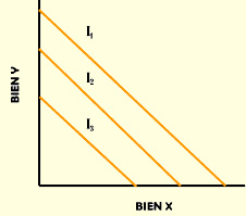
An indifference curve map is a graphical tool used in economics to illustrate the combinations of goods between which a consumer is indifferent. These curves represent different levels of utility that a consumer obtains from consuming different quantities of two goods. The concept allows us to understand how consumer preferences change and how consumption can be optimized under budget constraints.
Components of the Indifference Curve Map
Assets in Axes
In an indifference curve map, the axes typically represent two different goods, such as good X and good Y. For example, the horizontal axis might represent the number of units of one product, such as hamburgers , while the vertical axis might represent another product, such as soft drinks.
Indifference Curves
Indifference curves are lines that connect different combinations of two goods that provide the same level of satisfaction to the consumer. These curves are typically convex to the origin due to the principle of diminishing marginal utility.
Utility Levels
Each indifference curve corresponds to a specific level of utility . As you move up the graph, you reach higher levels of utility , indicating that the consumer prefers the combinations of goods on those curves compared to those below them.
Properties of Indifference Curves
Monotony
Indifference curves show that, in general, a consumer would like to have more of both goods. If there is an increase in the quantity of one of the goods, the consumer's satisfaction will most likely also increase, thus demonstrating a preference for equate supply and demand.
Convexity
The convexity of indifference curves implies that a consumer will value a combination of goods in moderate proportions more than a large quantity of a single good. This means that intermediate combinations are preferred to extremes.
No Intersection
Indifference curves must not intersect. If two indifference curves were to intersect, it would imply that the same level of utility could be achieved with different combinations of goods, which contradicts the principle of consistency of preferences.
Examples of Indifference Curve Maps
Example 1: Fast Food and Beverages
Let's consider a consumer who has the option of choosing between hamburgers and soft drinks . The indifference curve map can plot different combinations that provide the consumer with the same level of satisfaction :
- Curve 1: 2 hamburgers and 3 soft drinks
- Curve 2: 3 hamburgers and 2 soft drinks
- Curve 3: 4 hamburgers and 1 soda
Example 2: Education and Leisure
In another example, let's consider a student who must choose between hours spent studying and hours of leisure . The indifference curves that would form in this case could illustrate how the student values the balance between time spent studying and time spent enjoying leisure:
- Curve A: 5 hours of study and 1 hour of leisure
- Curve B: 3 hours of study and 2 hours of leisure
- Curve C: 2 hours of study and 3 hours of leisure
Drawing an Indifference Curve Map
Tools needed
To draw an indifference curve map, you need a sheet of paper , a pencil , and preferably a ruler to draw the axes correctly. You can also use drawing software or spreadsheet applications like Excel to create more complex graphs.
Steps to Draw
- Draw a system of axes, with good X on the horizontal axis and good Y on the vertical axis.
- Mark different combinations of both goods in the graph according to the examples.
- Connect the dots that represent levels of utility equivalents with smooth curves.
- Repeat this process for the different indifference curves.
Relationship with the Production Possibilities Frontier
The indifference curve map is closely related to the production possibilities frontier (PPF) , which represents the different maximum combinations of goods that can be produced with available resources. While the indifference curve map focuses on consumer preferences, the PPF focuses on production constraints.
Practical Applications of the Indifference Curve Map
Consumption Optimization
One of the most important uses of an indifference curve map is consumption optimization . Consumers can use it to maximize utility within their budget constraints . Through this analysis, they can determine the optimal combination of goods to achieve maximum satisfaction.
Economic politics
Economists also use these maps to design economic policies . By understanding consumer preferences and behaviors, policymakers can better formulate effective measures that positively impact the economy.
Market Studies
Companies use the concept of indifference curve maps in market analysis to segment and better understand their consumers. This allows them to offer products that align with preferences and maximize customer satisfaction.
Limitations of the Indifference Curve Map
Simplification of Behaviors
One of the most common criticisms is that indifference curve maps oversimplify consumer behavior. In reality, consumption decisions are influenced by many external factors, such as price , availability of goods , and changes in preferences over time.
Indifference curve maps assume that consumer preferences are static , which does not reflect the true dynamic nature of consumption decisions.
Information Requirements
For an indifference curve map to be effective, a significant amount of information about consumer preferences is required, which is not always available or easily obtained.